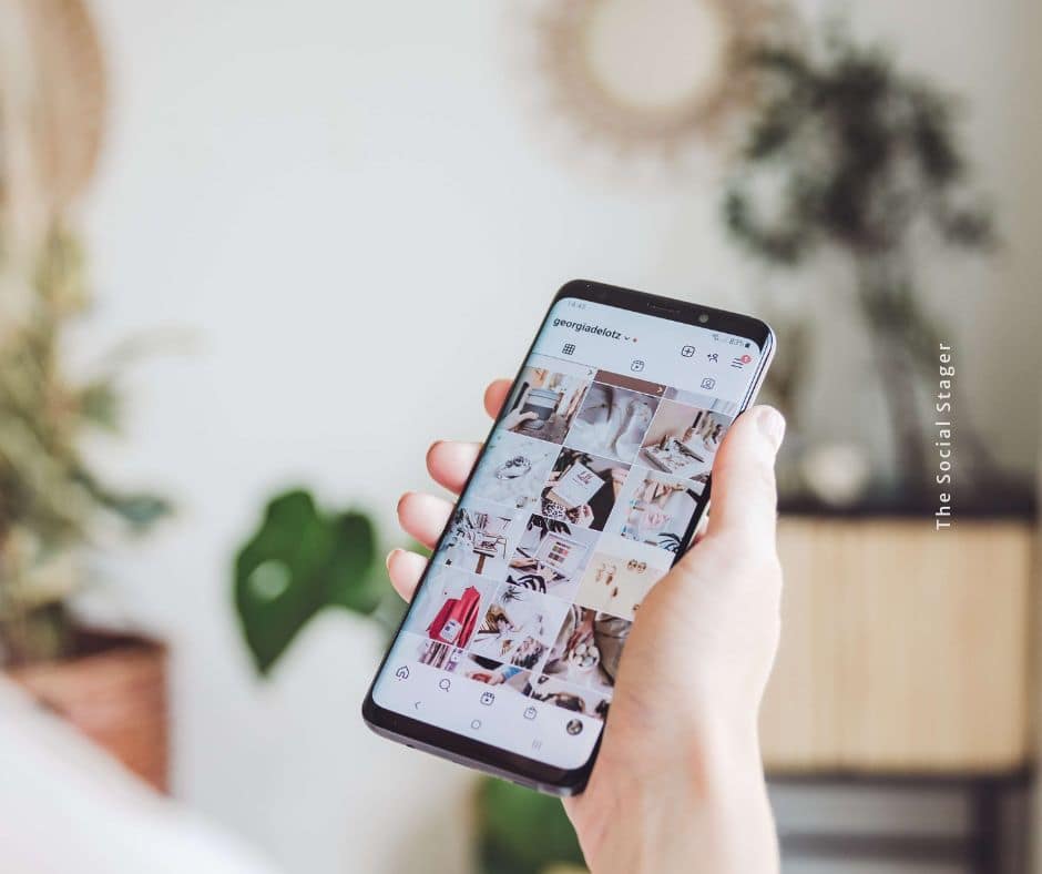
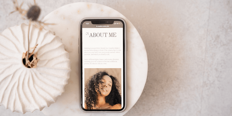
When it comes to building a luxury home staging brand, your visual identity isn’t just about aesthetics; it’s about creating a feeling. Color plays a powerful role in how your brand is perceived, influencing everything from first impressions to whether or not a client clicks “book a consult.”
The right color palette will elevate your brand, attract high-end clients, and help you establish a distinct visual identity. The wrong one? It can send mixed messages, confuse potential clients, and make your marketing feel disconnected from the actual spaces you design.
So if you’re building or refreshing your brand this year, keep reading — these five luxury home staging brand palettes are here to inspire your next move.
Why Color Is a Dealbreaker in Your Home Staging Brand Identity
Luxury isn’t just about price point. It’s about perception, and color sets the tone.
Certain colors immediately evoke a sense of elegance, calm, exclusivity, or trust. Think rich taupes, soft greys, muted mauves, warm stone hues, or creamy neutrals. These shades tell a story before anyone even reads your tagline.
That’s why your home staging brand identity should reflect more than just your favorite colors — it needs to align with how you want your ideal clients to feel. If your design style is modern and sophisticated, but your brand colors are bright, trendy, and playful, there’s going to be a disconnect. That disconnect can be the difference between landing your dream client… or losing them to someone whose brand looks more aligned.
When we work with home staging clients to create their brand identity, choosing the right palette is one of the first things we dial in — because it influences everything else, from their website to how confident they feel showing up online. That’s exactly why our brand development services include a deep dive into visual identity — so your brand doesn’t just look good, it feels like you and speaks to the luxury clientele you want to attract.
5 Luxury Home Staging Brand Palettes to Elevate Your Look
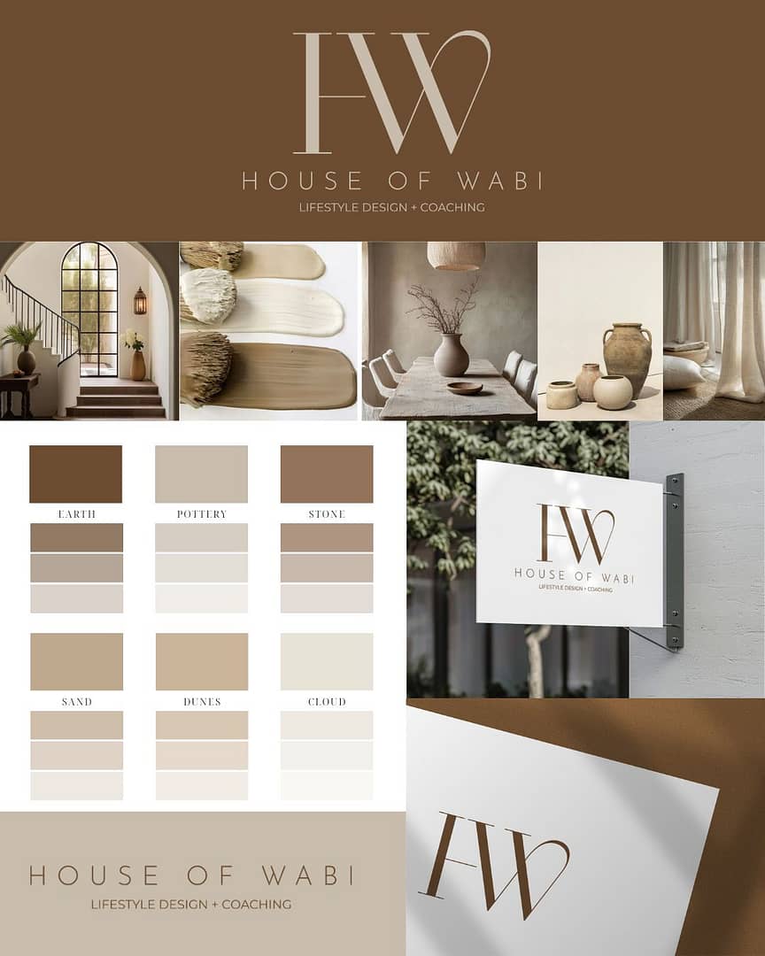
Each of these curated palettes was designed to help home stagers and interior designers create an elevated visual branding experience that feels both timeless and unique. Whether you’re going for feminine sophistication, minimalist edge, or earthy elegance, these luxury palettes deliver.
Milla
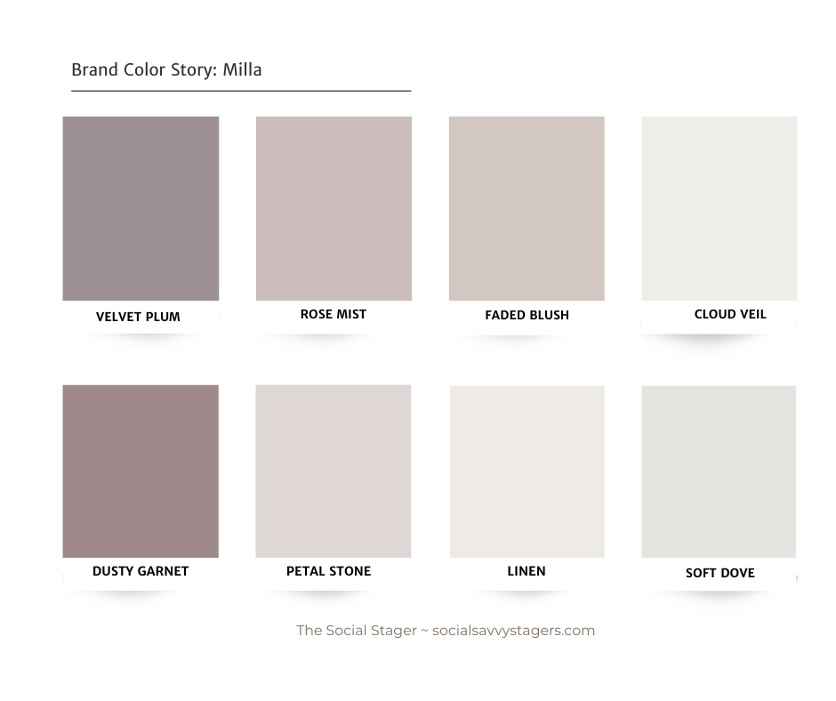
Soft, romantic, and polished — Milla is all about sophisticated femininity. With muted lilacs, dusty taupes, and creamy tones, this palette is perfect for stagers who style with warm neutrals, layered textures, and upscale finishes.
Bliss
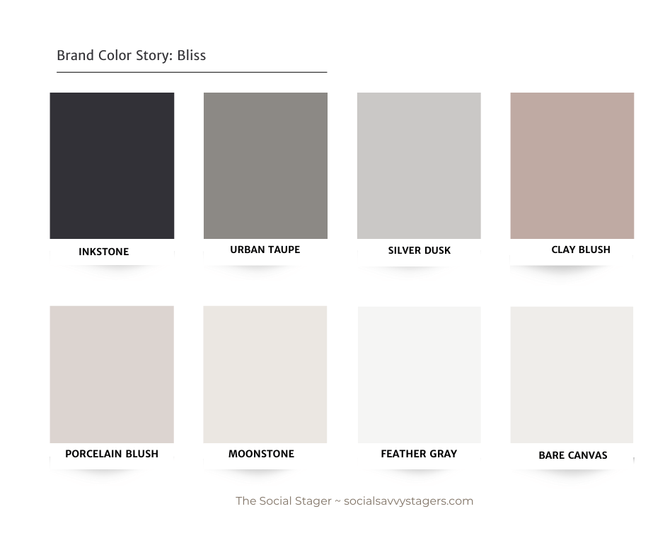
Understated yet bold, Bliss blends moody charcoal with soft greys and warm blush tones. It’s modern, edgy, and luxe without being loud — ideal for brands that want to stand out while keeping it classy.
Silk
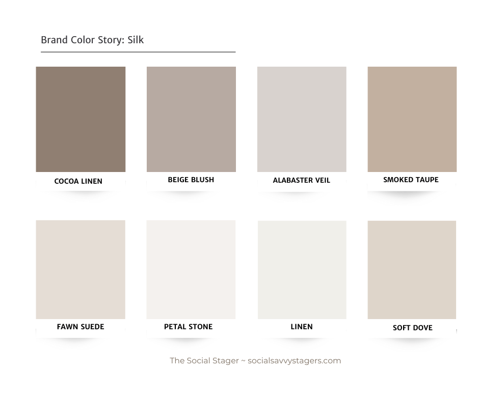
Think effortless elegance. Silk is warm, inviting, and calming, with notes of oatmeal, soft beige, and earthy mushroom. If your staging style leans toward organic textures, neutral palettes, and subtle contrast, this brand look will feel right at home.
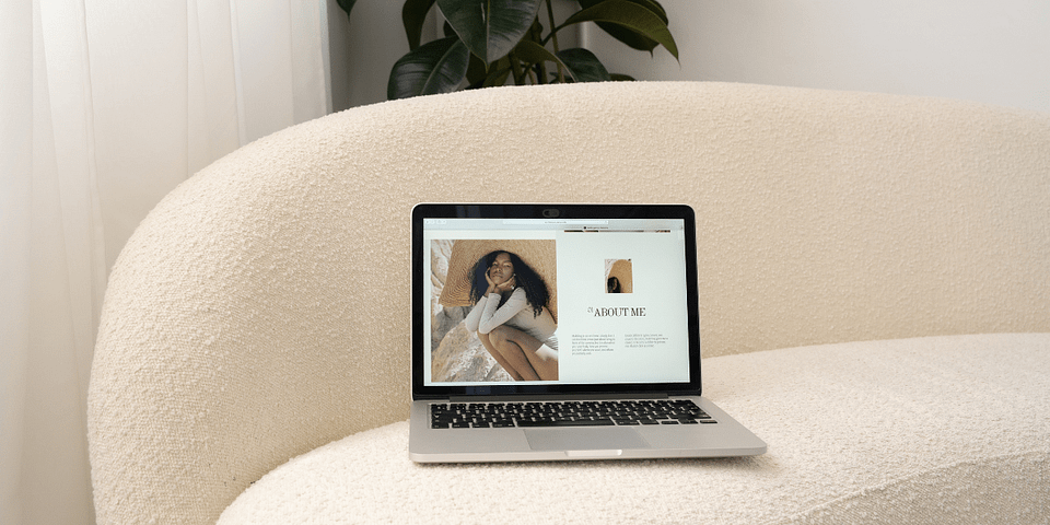
This palette also works beautifully on websites and printed materials where you want everything to look cohesive and calming.
Cashmere
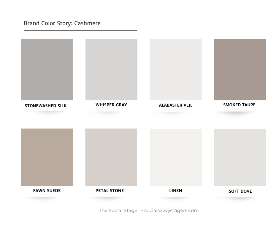
Cool-toned and confident, Cashmere combines soft greys, pale stone shades, and mushroom undertones to create a brand that feels expensive without trying too hard. If your design vibe is clean, polished, and sophisticated, this one’s for you.
We love using this palette in our luxury home staging brand projects, especially for stagers who want to feel elevated without leaning too feminine or trendy.
Rose Garden
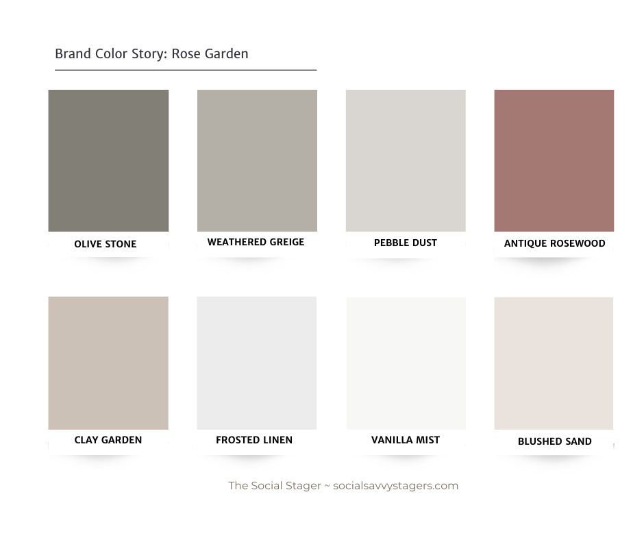
Organic, feminine, and quietly luxe — Rose Garden blends grounded neutrals and warm rosy tones for a natural, high-end feel. Perfect for stagers who create sophisticated designs with a touch of drama or who want to blend earthiness with elegance.
You’ll find a luxury color palette featured in our luxury home staging social media templates in our shop.
Choose a Brand Palette That Aligns With Your Work
Here’s the truth: your visual brand should reflect the kind of work you do, not just the kind of work you want to do.
If your portfolio is filled with modern, elegant homes staged in warm neutrals, but your brand uses bright pops of color or ultra-modern fonts, potential clients might scroll right past. The goal of branding is to create consistency and connection between your style and your presence.
When we work with brand development clients, we always start with an audit of their staging style so we can recommend colors and fonts that match their vision. That’s how we build brands that feel intentional, not accidental — and that actually attract the right clients. In one of our recent branding projects, we helped an established home staging company known for its elevated designs create a brand just as memorable.
And yes, that includes creating a custom color palette that’s rooted in your work, not someone else’s.
Ready to Elevate Your Home Staging Brand?
If your current brand doesn’t reflect your values, vision, or design style, it may be time for a refresh.
Whether you’re ready for a complete rebrand or want a more elevated look across your marketing, we can help. My branding services are designed for home stagers and interior designers who want a visual brand identity that is authentic, polished, and aligned with the work they want to be known for.
Let’s make your brand feel as elevated as the spaces you create.